Staff Reporters
Jan 08, 2019

Mastercard strips its name from its logo

Iconic red and yellow overlapping circles will stand alone for the first time since their introduction in 1968.

Mastercard strips its name from its logo

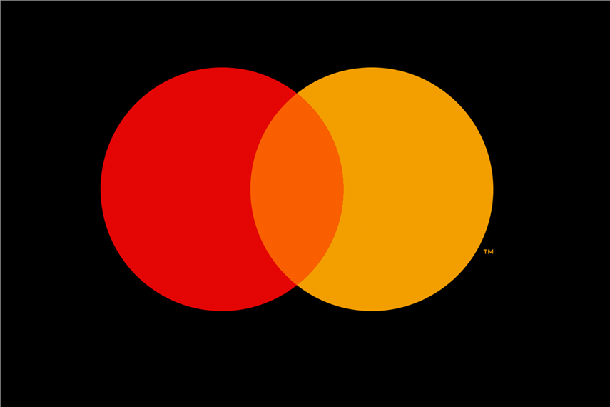
Fifty years after introducing its logo of interlocking red and yellow circles, Mastercard has simplified its official logo by stripping the name 'mastercard' from it. The credit card firm now refers to its standalone logo of two circles as the 'Mastercard symbol'.

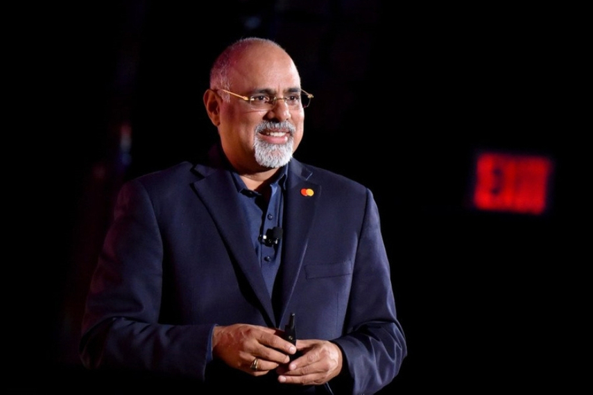
"Reinvention in the digital age calls for modern simplicity," said Raja Rajamannar, chief marketing and communication officer at Mastercard, in a release. "And with more than 80% of people spontaneously recognizing the Mastercard symbol without the word 'Mastercard,' we felt ready to take this next step in our brand evolution."

The move, aimed at simplifying its brand recognition, not only purports to provide "crisper", modern, simple and flexible look, but also aims to be more relevant for the digital era, the company said.

"This logo alone can represent Mastercard better than one word ever could," the release stated. "The evolved logo also allows partners, merchants, and the company to use the necessary branding seamlessly across the digital landscape."

“We live in a time where, increasingly, we communicate not through words but through icons and symbols," said Michael Bierut, partner at design agency Pentagram who worked on the logo. “Now, by allowing this symbol to shine on its own, Mastercard enters an elite cadre of brands that are represented not by name, but by symbol: an apple, a target, a swoosh. Mastercard's two interlocking circles have always represented their commitment to connecting people. Now, that commitment is given greater presence by Mastercard's status as a symbol brand."
 
Mastercard logo evolution over time
 
After Mastercard's inception in 1966, its logo of interlocking circles was created in 1968 and underwent refreshes in 1979, 1990 and 1996 in which the name Mastercard became successively bolder. That changed in 2016 when the circles stood on their own and the name 'mastercard' was placed below them.
 
Source:
Campaign India

Related Articles

Just Published

1 day ago

Parle retains top spot as India’s most chosen ...

Britannia clinches OOH leadership hat-trick, as per the Worldpanel Brand Footprint India 2025 report.

1 day ago

AI makes space for risk — if creatives dare take it

Landor’s global chief creative officer Teemu Suviala argues efficiency should fuel experimentation, not sameness, as advertising wrestles with AI, data obsession and risk aversion.

1 day ago

Asia can’t win globally if it doesn’t back itself ...

Asia has the creative firepower, the campaigns, the awards. What’s missing, David Guerrero writes, is seeing, decoding, and defending each other across markets.