Arvind Hickman
Oct 13, 2021

PHD refreshes brand with audio visual focus

New logo and animation designed by Cosmo Jameson

PHD refreshes brand with audio visual focus

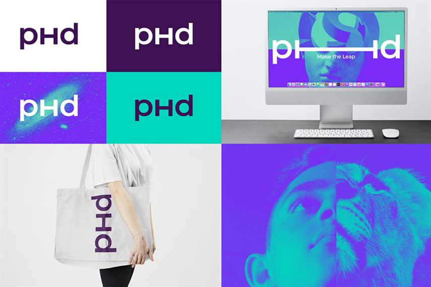
Omnicom media agency network PHD has refreshed its brand identity with a new logo and audio visual features designed to reflect its "Make the leap" philosophy.

The new look was created in collaboration with independent design director Cosmo Jameson and conceived with digital, motion and audio capabilities in mind.

The agency said the branding represents PHD’s values of “creativity, courage, openness, collaboration and curiosity”, which is “a reflection of the fact that it’s the creativity and innovation of PHD’s talent that powers business growth”. 

Major differences in the logo include a slimmer font, spaced-out letters, an uppercase "h" and the use of a sans serif font for the "d".

The branding is being rolled out internally and externally across the more than 100 markets PHD operates in.

The identity is being brought to life with brand imagery and a film (see below) that the agency said “allows the viewer to feel the brand values by showing the duality of a world reimagined from one state to another through visual lateral leaps”.

PHD launches new global visual identity from PHD Worldwide on Vimeo.

Philippa Brown, PHD's worldwide chief executive, said: “Creativity and the power of imagination are what fuel our industry and we believe that only by making imaginative leaps in creativity can we best help our clients flourish and, therefore, leap forward commercially.

“The evolution of our identity brings this idea to life, with a contemporary and dynamic mark that positions us for the future.”

Mark Holden, worldwide chief strategy officer, added: “That’s why our new identity focuses on creativity above all else, because it’s the power of imagination that drives disproportionate growth, not just reports and spreadsheets.”

PHD’s global marketing chief, Avril Canavan, said the identity was designed with digital and motion in mind to “reflect how we work today as well as being a symbol of our ethos”.

Jameson added: “The mark has been designed to harness a sense of kinetic energy. Its rotational symmetry allows it to demonstrate its ambigram qualities in motion but in static, its form somewhat suggests it’s about to spring into action at any moment.”

(This article first appeared on CampaignLive.co.uk)

Source:
Campaign India

Just Published

1 day ago

Women Leading Change 2024 shortlist revealed

See the women and companies shortlisted for the eighth annual awards. The winners will be announced at a live presentation on May14th at Marina Bay Sands.

1 day ago

Amazon CEO Andy Jassy on using AI to win over ...

The e-commerce giant’s CEO revealed fresh insights into the company's future plans on all things consumer behaviour, AI, Amazon Ads and Prime Video.

1 day ago

Hideous Luxury unpacks the weight of "emotional ...

The film is equal parts visually-striking and bizarre, as it tackles the idea of carrying burdens both literally and metaphorically.

1 day ago

Goafest 2024 and ABBY Awards to be held in Mumbai ...

The much-anticipated Goafest will now take place at the Westin Powai in Mumbai from May 29 to 31.