Campaign India Team
Sep 16, 2011

Patrika revamps itself

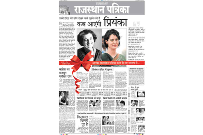
The new look was introduced by a teaser ad which featured pictures of Priyanka Gandhi and Indira Gandhi

Patrika revamps itself

Patrika has revamped itself to give itself a new youthful look. The new look was introduced by a teaser ad which featured a fresh colour picture of Priyanka Gandhi, next to a black and white picture of Indira Gandhi, to symbolise the move.

With the new format, Patrika looks is positioning itself as a reader friendly, easily navigable, innovative and original newspaper.
 
From the advertiser's point of view, there are some great innovations on offing, such as the front page solus, which has been re-positioned from bottom right hand side. The sixth, sevent and eighth column has been moved towards the fifth, sixth and seventh column; thus, making it more like an island position wrapped with news all around rather than occupying just the corner of newspaper. The new solus position definitely gives a better edge to advertisers, as it ensures more eye balls than the classical solus position, also the pagination now enables you to position your advertisement as per the TG, as the pages have pre-designated features appearing on specific pages as per readership habit profiling.
 
Commenting on the development, Bhuwnesh Jain, deputy editor, Patrika group, said, “ Patrika is definitely, as all other media gearing up to cater better to youth readers, but what is important to us and would be carefully ensured that it maintains its core values. Changing with time is imperative, Patrika is known as a very proactive organisation always striving to deliver better and keeping the readers’ interest first.”
 
Saurabh Bhandari, assistant general manager, marketing, Patrika group, adds, “The interactive new format is sure to provide Patrika teeth in the crucial season time. The advertiser will be more than pleased to gain from the extra effort put by Patrika to provide not just the penetration but greater impact with its enhanced response power and better visibility.”
 
Sumant Verma, national creative head, Newsroom Design Cell, said “The design has been done with a view to support and supplements the content, the classical ad spaces have been re-located to move away from the blind spots. To make it more reader friendly the pages are structured to go with the eye movement. The accent of design is to re-position the product to Sec A & B tastes, liking, and preferences.” The newspaper now comes with new sleek set of fonts, where only secondary colours have been used. A reverse mast head is a marked departure from usual newspaper format. A bar code clearly displays on the newspaper, vouching the professional approach."
 
Work shops and staff training has been orgainsed to keep the team abreast with the new revamp.
 
Source:
Campaign India

Related Articles

Just Published

12 hours ago

Safety concerns rise as MDH and Everest spices face ...

The FSSAI will soon be initiating an inquiry after Hong Kong and Singapore banned the two spice brands for allegedly containing carcinogens.

12 hours ago

Times of India launches 'My City, My Art' challenge ...

Participants are encouraged to unleash their creativity by reimagining their cities through artistic expression.

13 hours ago

Goafest unveils 'age of adaptability' theme for 2024

A chameleon has been selected as the 2024 event mascot, symbolising the industry's need to continuously evolve in response to changing environments.

14 hours ago

Google delays cookie deprecation again: APAC adtech ...

Google will now phase out cookies entirely in 2025 after being told the concerns around Privacy Sandbox still need to be addressed.