
Tech start-up Sugarbox has announced its new identity to reflect ‘digital sugar’ - the new ecosystem enabled by the company.
The transformation was brought about by Landor & Fitch, with an aim to align with the brand’s change to business goals, vision, and an ambitious future-forward story.
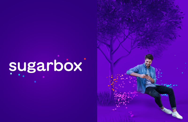
The colour palette, typefaces, combination of bold with warm colours, and the typography were all the elements used to create the Sugarbox visual language.
Rohit Paranjpe, co-founder and CEO Sugarbox, said, “The intent of this brand transformation delivers two-fold objectives – to deepen our commitment as enablers of digital access and emphasise on the potential to impact Digitisation. It is the need of the hour to stay relevant for our stakeholders, with simplicity and potential. The idea of ‘the link to limitless’ speaks about our focus to build the internet of the future of connected devices, applications, people and things. We are glad that team Landor & Fitch brilliantly connected all the dots to bring forth a powerful narrative for the brand,”
Lulu Raghavan, managing director, Landor & Fitch, said, “One of the things that truly impressed us was that an organisation in the technology domain was thinking about brand identity as a powerful signal of change and transformation. We met the Leadership team and understood that Sugarbox as an organisation was focused to embrace innovation. This is where the idea of ‘the link to limitless’ took form. It was a straightforward brief - focused positioning and memorable messaging. This gave us an opportunity to make a difference and showcase the metaphor of a sweet box, aesthetically and verbally”.