
Please sign in or register
Existing users sign in here
Having trouble signing in?
Contact Customer Support at
[email protected]
or call+91 22 69489600
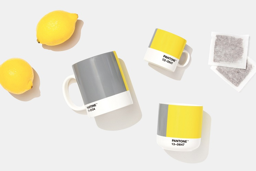
The biggest colour trends of 2021 are taking a cue from the tumultuous year just gone by, and giving people a sense of ‘hope, optimism and the refresh that many are looking for’ in the new year, says the author
Contact Customer Support at
[email protected]
or call+91 22 69489600
Top news, insights and analysis every weekday
Sign up for Campaign Bulletins


.jpeg&h=268&w=401&q=100&v=20250320&c=1)
Campaign India has wrapped its coverage for 2025 with a new look and fresh premium content awaiting in the new year.
.png&h=268&w=401&q=100&v=20250320&c=1)
Restructures, mergers, account moves and of course, celebrity brand ambassadors made headlines in 2025. Here's a look back...
.png&h=268&w=401&q=100&v=20250320&c=1)
Industry leaders do a little crystal ball gazing and predict how the transformative tech will shape their industry or job function in 2026.

Tanishq pairs Bollywood couple Javed Akhtar and Shabana Azmi to sell natural diamonds, but then lets provenance speak louder than romance.
