

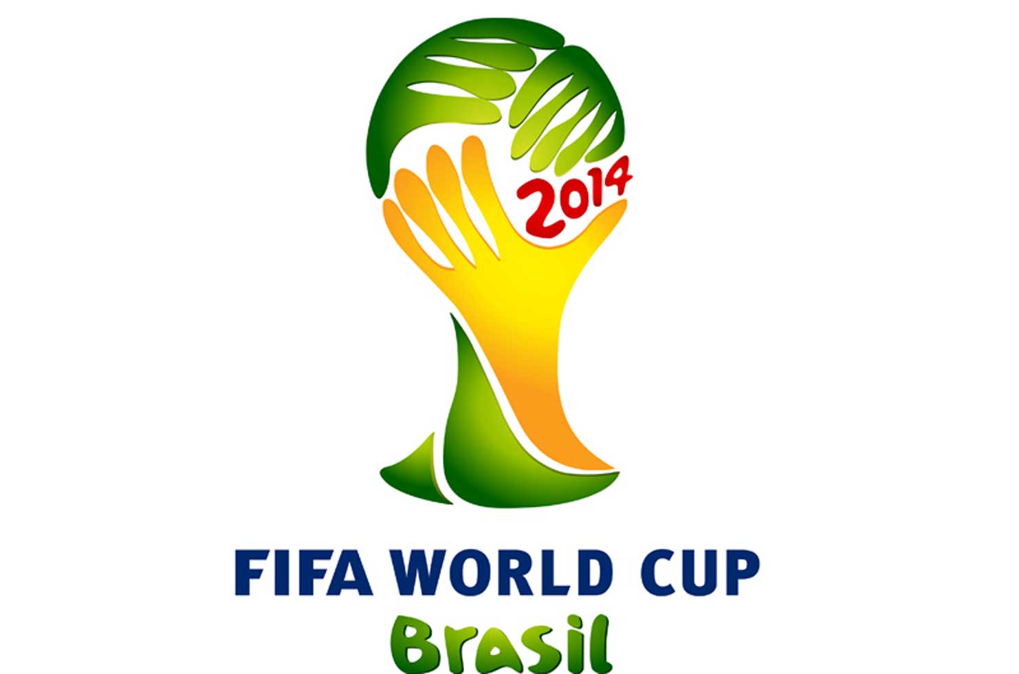
The Brazil 2014 logo has received quite a lot of flak for bearing an uncanny resemblance to the face-palm – a sign of shame or embarrassment - a fact that gained greater prominence after the host nation’s 1 - 7 drubbing by Germany this week. As well as causing a wry smile, this got me thinking about FIFA World Cup logos and posters from history.
Brazil 1950
The last time Brazil hosted the World Cup was in 1950, the return of the tournament following a 12-year break due to World War II and the first to include British participants.
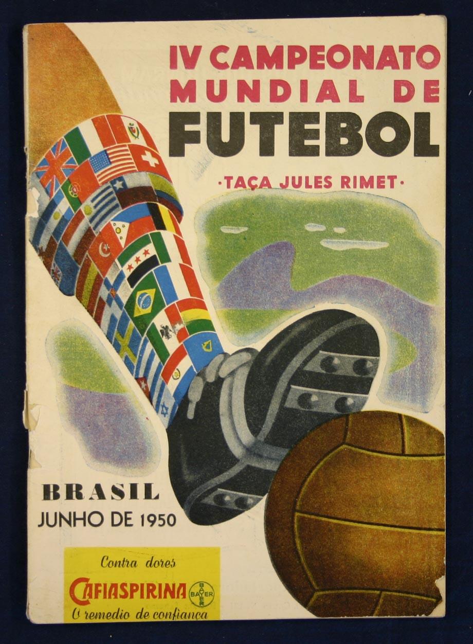
The logo was little more than a replica of the poster but it contains contemporary graphic design principals. Compared with 2014, the lettering is more subdued but the visual elements are strong. It’s fascinating to see the traditional leather football and six-studded boot featured. It also includes the flag of India, who were due to take part but later pulled out when FIFA decided they wouldn’t be allowed to play in bare feet.
England 1966
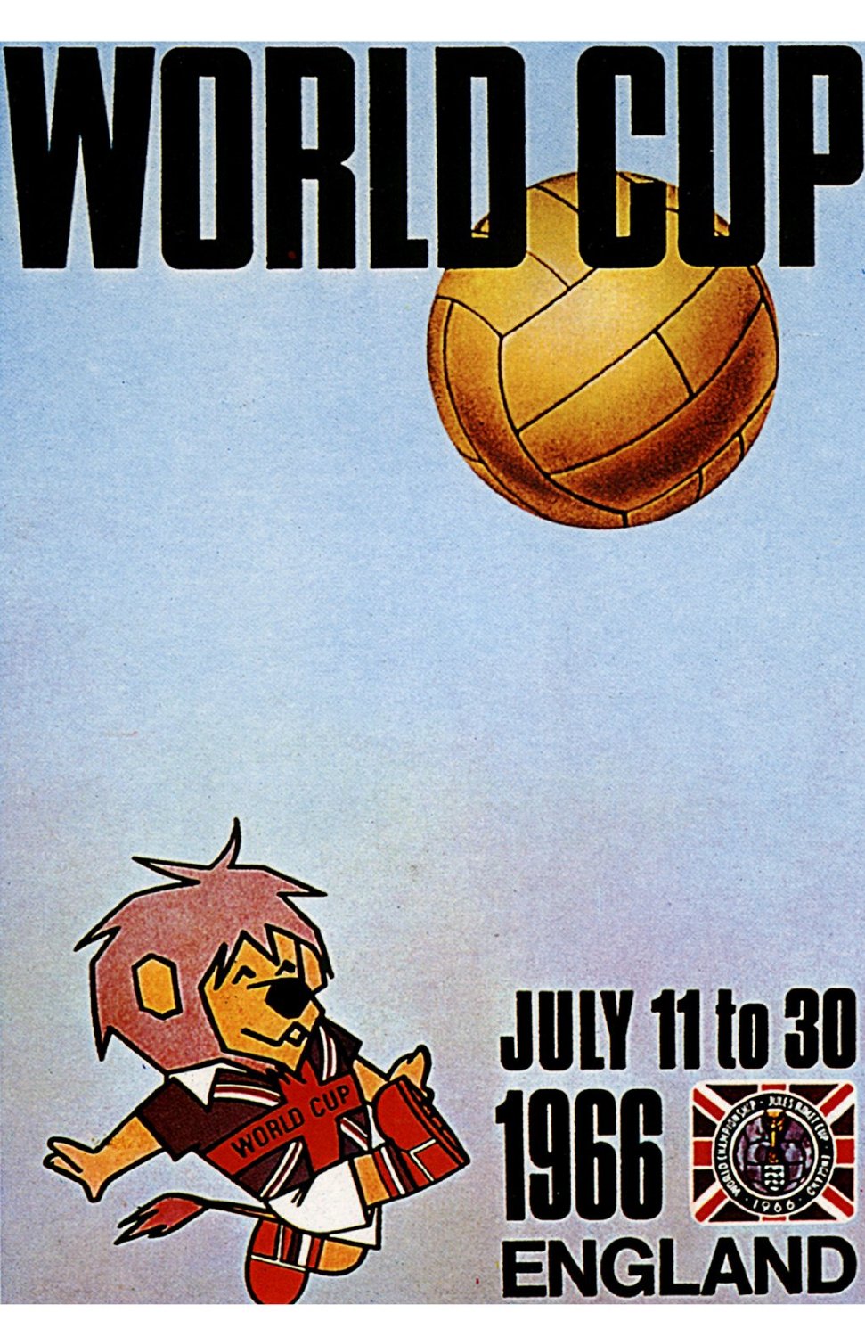
England in the 1960s is often viewed as a period of hedonistic excesses. The Beatles released their seventh album Revolver in August that year and the flower children of British youth were more interested in painting and poetry than football. The majority of the rest of society were conventional working class people, eager to be carried on the crest of a patriotic wave whilst the World Cup was played out in English cities.
The iconic poster featuring a lion kicking a golden football is fully representative of this more simplistic view of British culture. There’s no abstract font effects widely associated with album covers of the time. The logo doesn’t even try to disguise or manipulate the Union Jack flag - it simply flies it proudly with the key typographical elements forming a circle around the football at the centre.
Spain 1982
Four years, the period between World Cups, is a long time in design trends, especially around the onset of print technology in the Eighties.
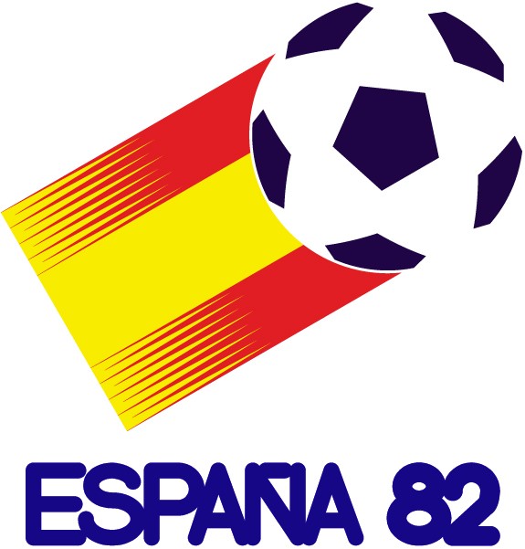
Towards the end of the Seventies, logo design was influenced by the start of desktop publishing and a rise in brand commercialisation. This resulted in the rise of the sans serif, producing cleaner typography that was free from the messy realities of everyday life.
If you look at Argentina 78 and Spain 82, you can clearly see how design was restricted by available memory on processors, only a handful of fonts to play with and a lack of available layers. The logos are flat and corporate. I like to think that for this reason, Joan Miro designed his iconic Espana 82 World Cup poster, which broke all the rules with its vibrancy and surrealism. It portrays the tournament as a Spanish fiesta and gives life and energy back to the game.
Italy 1990
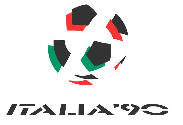
Perhaps the most iconic of all is Italia 90, which took the flat, desktop-published logos of the previous three tournaments and added movement, layers and depth. It was the first of modern times to add a sense of playfulness. It appears to be an existing typeface, turned stencil, and distorted with a pitch-like resemblance for the ball to play on. Its imperfect typographic balance between the letter I and the T versus the wide-reaching ‘90’ add to its energy and iconic status that was way ahead of its time.
South Africa 2010 & Brazil 2014

In recent years, a more playful, expressive approach to type has become commonplace. Whilst sans serifs are still used extensively, the key visuals for South Africa and this year’s Brazil favour softer-edged scripts to depict a spirit of movement, warmth and friendliness.
Where the digital generation see a face-palm in Brazil 2014, I see the iconic photograph of three victorious hands lifting the Jules Rimet trophy and symbolising a humanitarian sporting occasion, with hands interlinked, showcasing a country ready to welcome the world to its colourful shores.


.jpg&h=334&w=500&q=100&v=20170226&c=1)


.jpg&h=268&w=401&q=100&v=20170226&c=1)

